
CSS 3D Transform model was presented as a draft specification in March 2009. This model allows Web developers to create user interfaces more attractive and interesting using advantages of 3D.
Creation of 3D objects is a good way to get started with CSS 3D Transform. For example, creation of a cube in 3D. In the first place, create html markup:
In this part we created a block with identifier «cube» and 6 children elements (sides of the cube). Next we define the basic styles:
.container {
    width: 200px;
    height: 200px;
    position: absolute;
    perspective: 1000px;
    top: 0;
    bottom: 0;
    right: 0;
    left: 0;
    margin: auto;
}

#cube {
    width: 100%;
    height: 100%;
    position: absolute;
    transform-style: preserve-3d;
}

#cube figure {
    width: 196px;
    height: 196px;
    display: block;
    position: absolute;
    border: 2px solid black
    font-size: 100px;
    text-align: center;
    line-height: 196px;
}

#cube .front {
transform: rotateY(0deg) translateZ(100px);
background: rgba(255, 255, 0, 0.5);
}
#cube .back {
transform: rotateX(180deg) translateZ(100px) rotateZ(180deg);
background: rgba(0, 0, 255, 0.5);
}
#cube .right {
transform: rotateY(90deg) translateZ(100px);
background: rgba(0, 128, 0, 0.5);
}
#cube .left {
transform: rotateY(-90deg) translateZ(100px);
background: rgba(255, 0, 0, 0.5);
}
#cube .top {
transform: rotateX(90deg) translateZ(100px);
background: rgba(165, 42, 42, 0.5);
}
#cube .bottom {
transform: rotateX(-90deg) translateZ(100px);
background: rgba(255, 165, 0, 0.5);
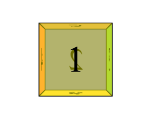
}Also, for each face, we set the background color. As a result, we get a cube in 3D on pure CSS:
The next step is to add the animation using CSS properties animation:
#cube {
    animation: rotating 10s;
    animation-iteration-count: infinite;
}
In the property animation you need to set two values. rotating – the name of animation, 10s – the execution time of animation.
The next property animation-iteration-count – the number of repetitions of animation, the value infinite sets an infinite number of repetitions of animation.
And now I would like to describe the animation by rule @keyframes:
@keyframes rotating {
0% {
transform: rotateY(0deg) rotateX(0deg);
}
12.5% {
transform: rotateY(-90deg) rotateX(0deg);
}
25% {
transform: rotateY(-180deg) rotateX(0deg);
}
37.5% {
transform: rotateY(-270deg) rotateX(0deg);
}
50% {
transform: rotateY(-360deg) rotateX(0deg);
}
62.5% {
transform: rotateY(-360deg) rotateX(-90deg);
}
75% {
transform: rotateY(-360deg) rotateX(-180deg);
}
87.5% {
transform: rotateY(-360deg) rotateX(-270deg);
}
100% {
transform: rotateY(-360deg) rotateX(-360deg);
}
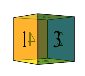
}In the end, we get the following:
As you see, it works relatively simply. But if anything needs explaining I’m happy to go into a bit more detail.
Categories
Tags
Favourite posts
Getting an e-Commerce website online might sound like a huge undertaking,...
WebView displays web pages. But we are interested not only in web-content...
Google Maps is a very famous and helpful service, which firmly entrenched...
RSpec is an integral part of Test Drive Development (TDD) and its main id...
When developing a web application that extensively works with user input ...
Field configuration defines behavior of all standart (system) fields and ...
As you might have already heard, the latest stuff for upgrading rails was...